Turtle Climate Change poster

Brief

Design a poster based on the information learned within the session today, using multiple assets to create the layout. This will be your first piece of work for your individual portfolio.

Due to the task being targeted at climate health, I decided to aim my poster design at the plastic pollution in the oceans across the word, as this massively effects the health of the ecosystems that call the oceans their home.

‘The link between plastic pollution and climate change should become more apparent as a result of the talks.
Both are of breathtaking significance in terms of the billions/trillions of dollars people will increasingly be forced to pay toward their mitigation and repair.
You might say plastic pollution is the stepmother of all economic externalities’: article by plasticpollutioncoalition.org.

From this I decided to daw up some concept art to start to brain storm some potential ideas that I could use for the design of the poster.
The impression that initially wanted to portray of the poster, was a very image showing the true, emotional and down too earth replication of the realism of how plastic can effect sea life such as turtles. With 1 million marine animals (including mammals, fish, sharks, turtles, and birds) killed each year due to plastic debris in the ocean, I felt that this would be a great subject t use for this project.

Research and development


My design work started out with a range of different types of layouts for the design of the poster, with some different variations for the design of the poster.
My main emphasis of the design of the poster was to ensure the message of plastic pollution would be conveyed across to the viewer, for them to fully understand the impact of plastic pollution in the oceans.

In my concepts I looked into using marine animals, such as Dolphins, Turtles and Jellyfish, all of which are impacted by the level of plastic In the oceans. Therefore I did different types of research into facts and figures into how plastic is and will, effect the climate in the not too distant future.

As well as this, I wanted to also use some quotes from a range of famous and inspirational people across the world, highlighting the importance of the oceans health for the ecosystem as well as for encouraging and inspiring others to protect the environment for future generations. One quote (which I did use for the final version of the poster) is “The Earth is what we all have in common” by Wendell Berry- Poet and Environmental activist. This quote I feel, is very inspirational and heavy hitting as it shows that despite all of out differences, the world is what all humanity have in common.
Build

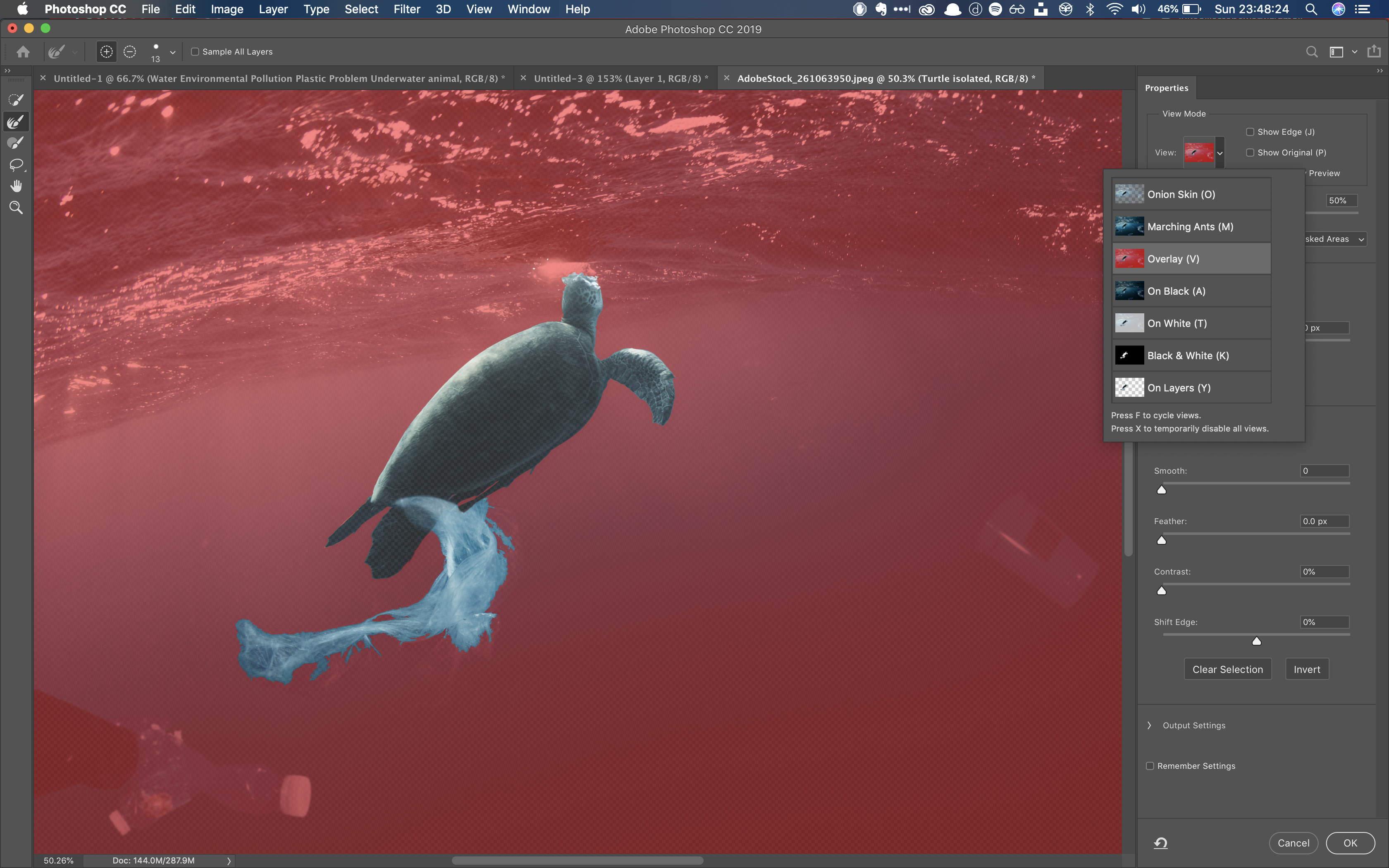
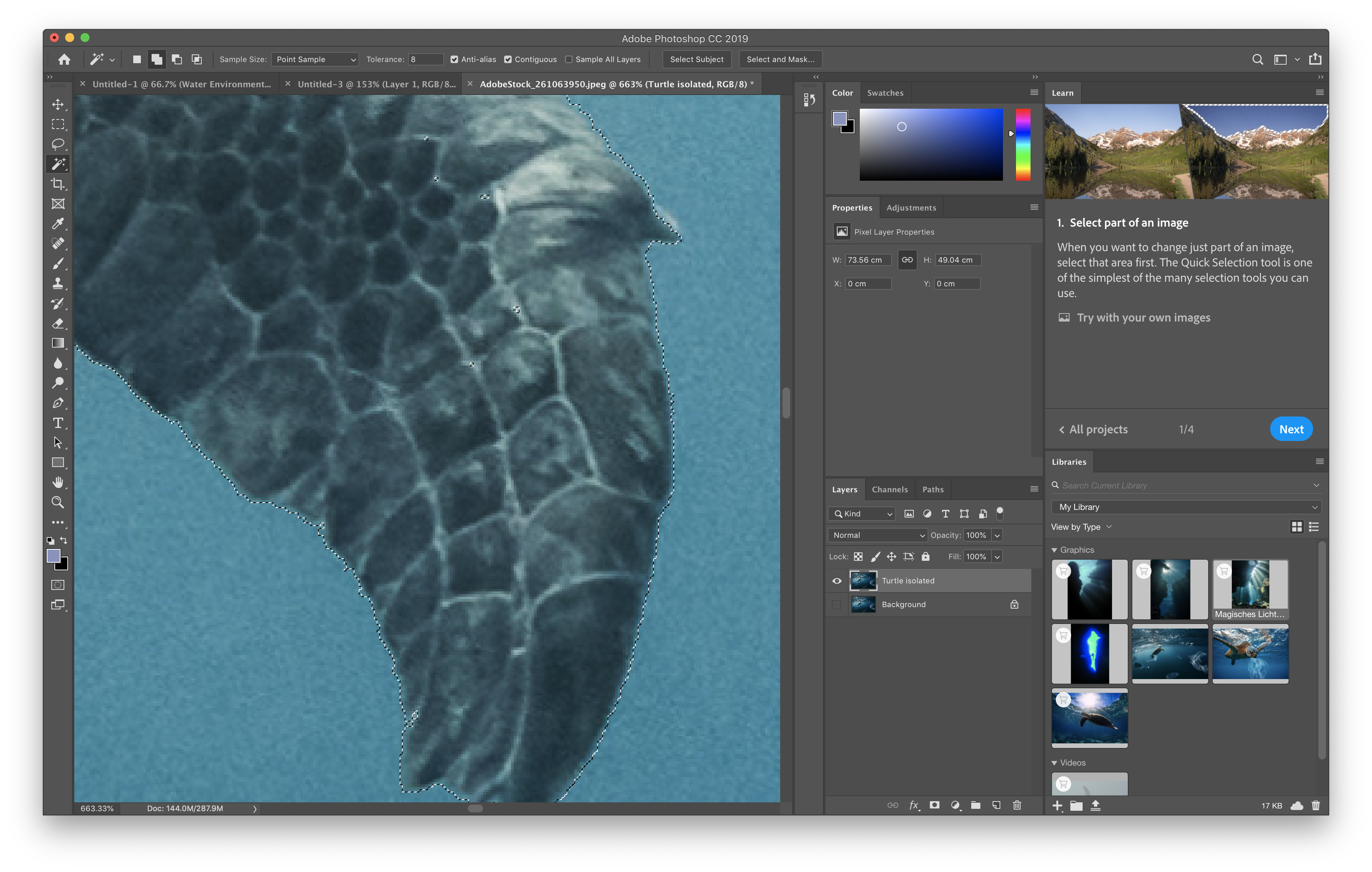
To start off I identified 3 images I felt would suit my initial designs from Adobe. I started by masking the outline of the turtle using the lasso and quick selection tool.
I ensured that I masked the plastic attached to the turtle’s flipper was also precisely masked.


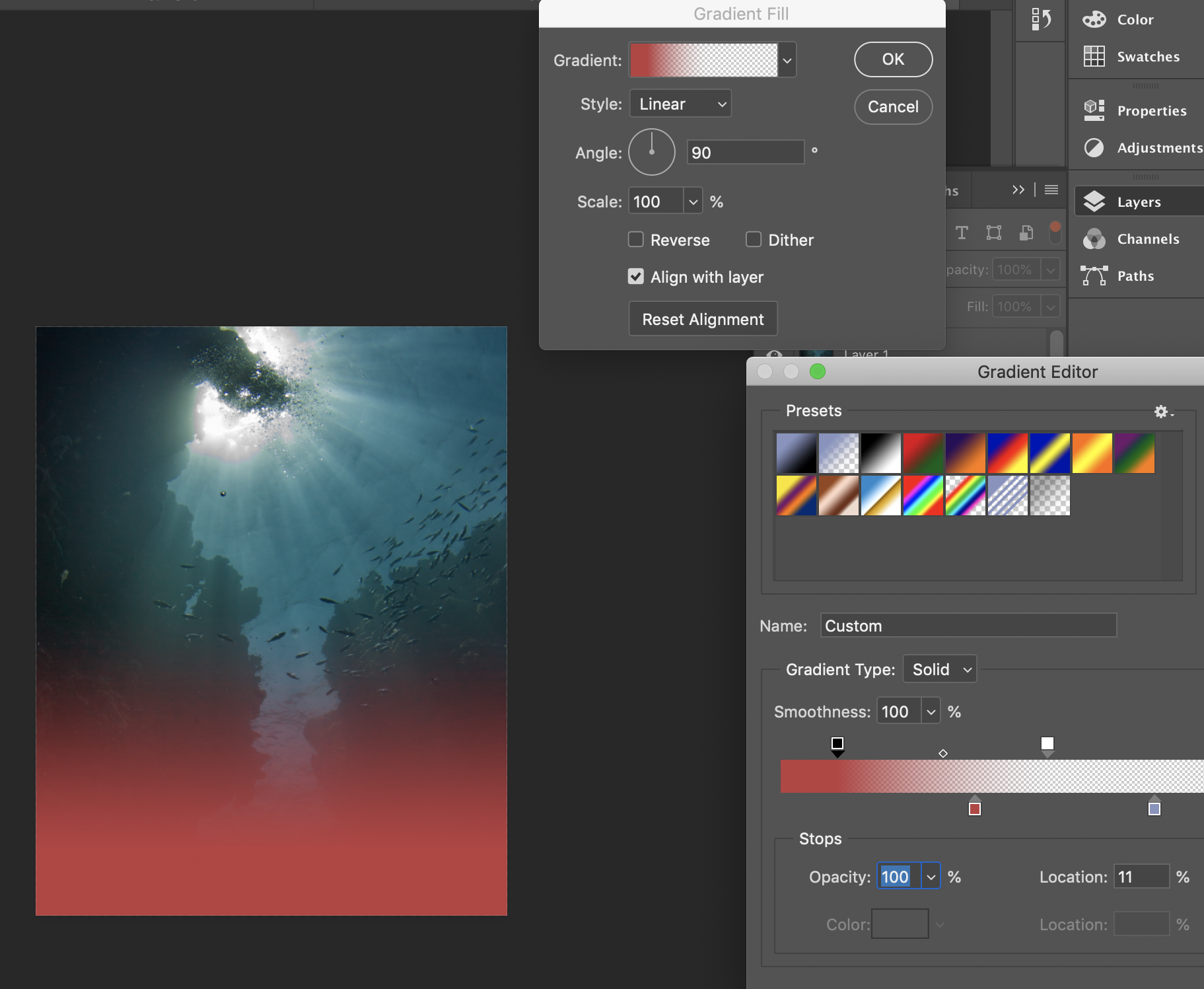
From there I then used the background of my second image to merge with the Turtle in the foreground, in order to start to build the poster design. I chose the background image due to it’s ascetically pleasing features which i initially concepted in my designs, with the variety of fish as well as the image giving off depth with the two coral cliffs in the background.

After combining the two images together, I then started to use gradients to alter the low half of the image to form a red tint. The red tint in the final quarter of the page, is meant to give off the effect of ‘death’ towards the viewer as it shows the turtle struggling to keep on swimming upwards due to the plastic on the bottom half, of its right flipper. The way that the red colour fades into the lower quarter of the poster, is meant to give off the effect off the approaching doom for the turtle.
After finding the desired alteration of the red colour, the base of the image was complete. `

Adobe Indesign. After completing the image of photoshop, I exported the file as a psd file and uploaded it onto Adobe indesign. Here I wanted to find the perfect font’s for the wording of the poster, was I felt that indesign would give a far broader spectrum of options for me to use.
I decided to use 2 different fonts for 3 different sets of text on my poster, as I felt that if I only used one font then reading the text wouldnt be so interesting at all. However if I used 3 different sets of fonts for each piece of text, then reading the text for the user would be more meticulous and wouldn’t blend together very well for the user to read.


Final Design


I decided to use DIN Condensed for the quotation by Wendel Berry and the inspirational quote written by my self at the bottom: "It’s up to you. No if’s, no buts. Only CHANGE is needed."

As well as American Typewriter, for the “Plastic in the ocean will tenfold by 2020”- source ‘EarthDay.org’ as American typewriter gives off the straight forward effect.

This poster I feel successfully broadcasts the effects of how plastic interferes with the ecosystem in the oceans, as well as matching the briefs critiea of “Encouging others to protect the climate”.